
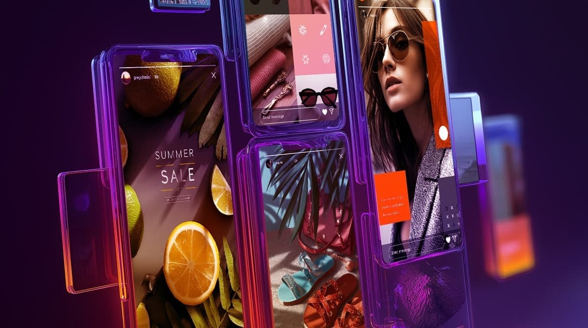
Ever stare at the blank Story screen wondering what to post — again?
One second, you’re uploading a photo. Next, you’re stuck choosing fonts, layering text, and trying to make it all look… intentional. Multiply that by five slides a day, and it’s no wonder most Stories end up looking rushed, inconsistent, or just plain boring.
For creators and brands alike, the challenge isn’t just what to say—it’s how to say it in a way that’s engaging, clear, and on-brand.
That’s where layout strategy comes in.
The right layout brings structure to your content, helps it feel more polished, and makes it easier for your audience to follow and respond. Whether you’re promoting something, sharing your vibe, or building trust, layout matters.
This guide breaks down practical Instagram Story layout ideas based on real content goals—so you’re never stuck staring at a blank screen again.
What Makes a Great Instagram Story Layout?
Even the best content can flop if the layout doesn’t support it. On Instagram Stories, design isn’t just about aesthetics—it’s about speed, clarity, and engagement. Your audience is tapping fast, and you’ve got a tiny screen and a few seconds to make it count.
Here’s what separates scroll-past content from Story layouts that actually work:
1. Visual Hierarchy
Your viewer should instantly know what to focus on first. That means:
- One clear focal point (usually your headline or image)
- Supporting elements in a clear order
- Enough space around your text or CTAs to make them stand out
Pro tip: Use font sizing, contrast, and placement to guide the eye.
All 5 of them need a screenshot to show what you mean. It’s highly visual content; without the examples, it doesn’t serve much value.
Or if it’s gonna repeat what you already presented below in the ideas section, merge the tips with the ideas. If it makes more sense.
2. Clean Composition (No Clutter)
Less is more. Seriously. Stories that try to cram in every thought, visual, or GIF at once usually just lose the viewer. Use:
- 1–2 fonts max
- Simple color schemes
- Consistent padding/margins (templates help a lot)
3. Mobile-Literate Design
Most people hold their phone in one hand and tap with a thumb. Your layout should respect that:
- Keep tappable elements like polls, links, and questions centered or low-mid screen
- Avoid tiny text in corners
- Don’t overload the top third with info—they’ll miss it
4. Brand Consistency (Without Boring Repetition)
If someone tapped through three of your Stories, would they recognize your style?
That doesn’t mean using the same template forever—but it does mean:
- Repeat brand fonts and colors
- Stick to a tone or theme (playful, minimal, editorial, etc.)
- Use your logo or watermark sparingly but consistently
5. One Purpose Per Slide
Each Story should do one thing well:
- Ask a question
- Deliver a tip
- Tease a product
- Share a mood
Trying to do all of the above in one slide? Your message gets diluted.
Perfect — now we’re totally dialed in. You want a visual-focused layout guide, where each layout idea is broken down by:
- What it looks like (clear, visual structure)
- Use case scenarios (when/why to use it)
- How to do it (tools, step-by-step, IG-native or external)
This will feel more like a designer’s reference guide than a brainstorm list. Clean, helpful, and super actionable.
Instagram Story Layout Ideas That Make Your Posts Look Better
Stories aren’t supposed to be perfect—but that doesn’t mean they have to look random. A good layout brings just enough structure to make your content feel clear, consistent, and actually worth watching all the way through.
It’s not about complicated design or over-edited slides. It’s about using simple formats that make your Stories feel intentional—like you meant for them to look that good.
Whether you’re posting as a brand, creator, or just trying to make your daily content a little sharper, having a few go-to layouts in your back pocket makes the process faster, easier, and way more scroll-stopping.
Below are 10 easy layout ideas to keep in rotation. Use them to make your Stories feel more intentional, more interactive, and way more on-brand (without spending forever making them).
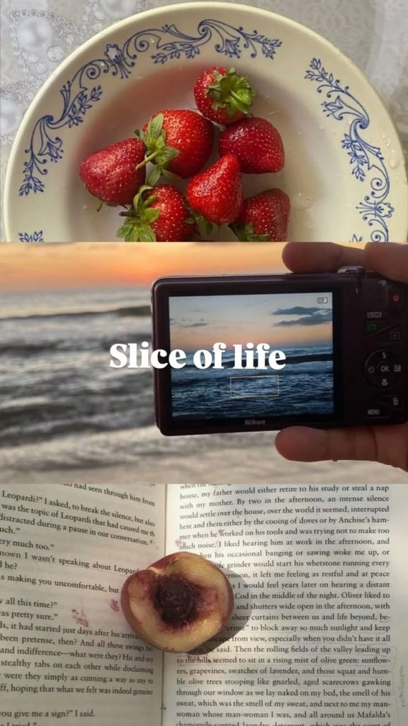
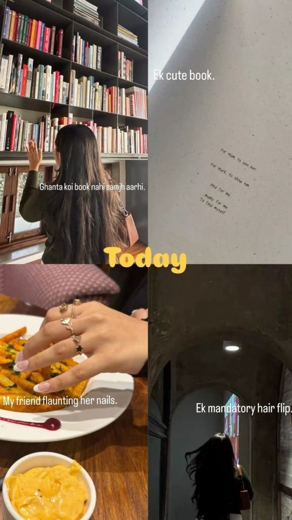
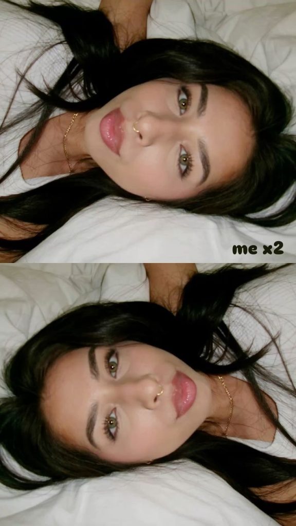
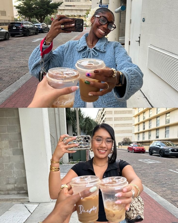
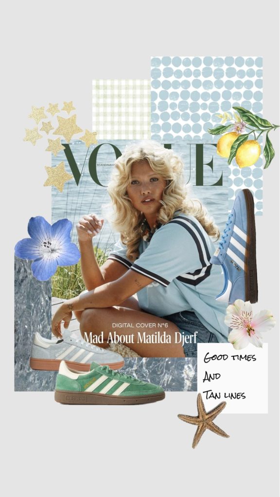
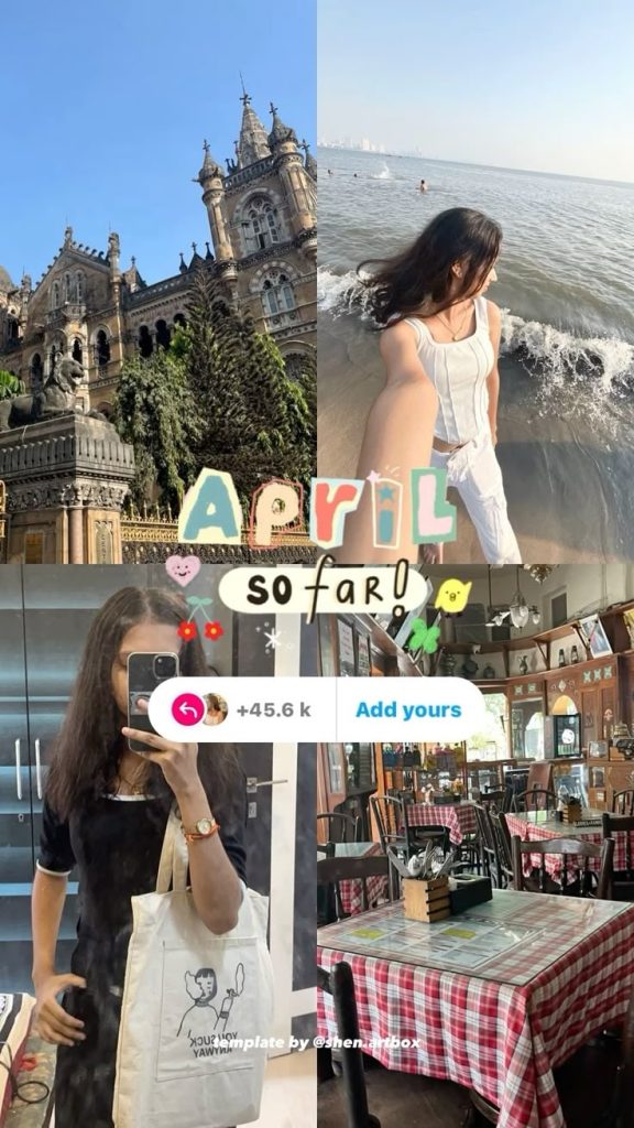
1. Collage Grid
What it looks like: A layout with multiple photos arranged neatly in one slide—usually in a grid. Think of it like a “photo dump,” but cleaner. It gives you a way to share a bunch of stuff at once without making it feel chaotic.
Use cases:
- Aesthetic photo dumps
- Visual storytelling (e.g. a day in the life, behind the scenes)
- Grouping textures, colors, or moods
How to do it: Use Canva, Unfold, or Instagram’s layout feature to drop 2–6 photos into a grid. Keep the background simple so the photos pop. You can leave it text-free or add a quick header like “life lately,” “weekend dump,” or whatever fits the mood.
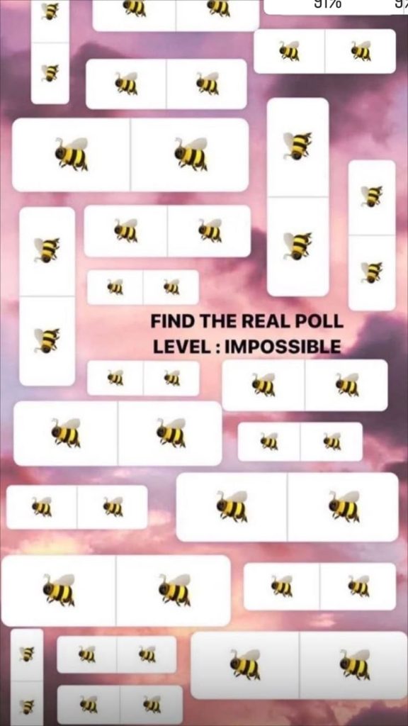
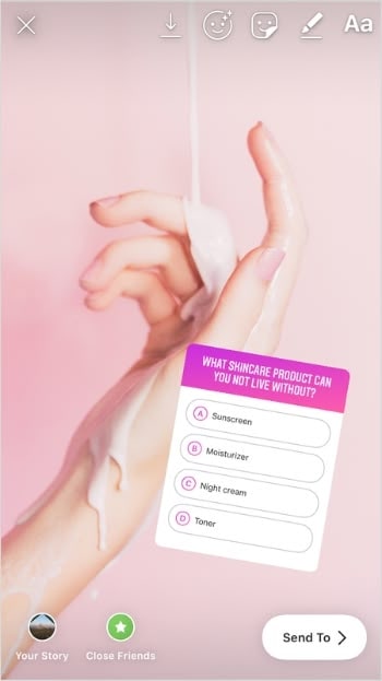
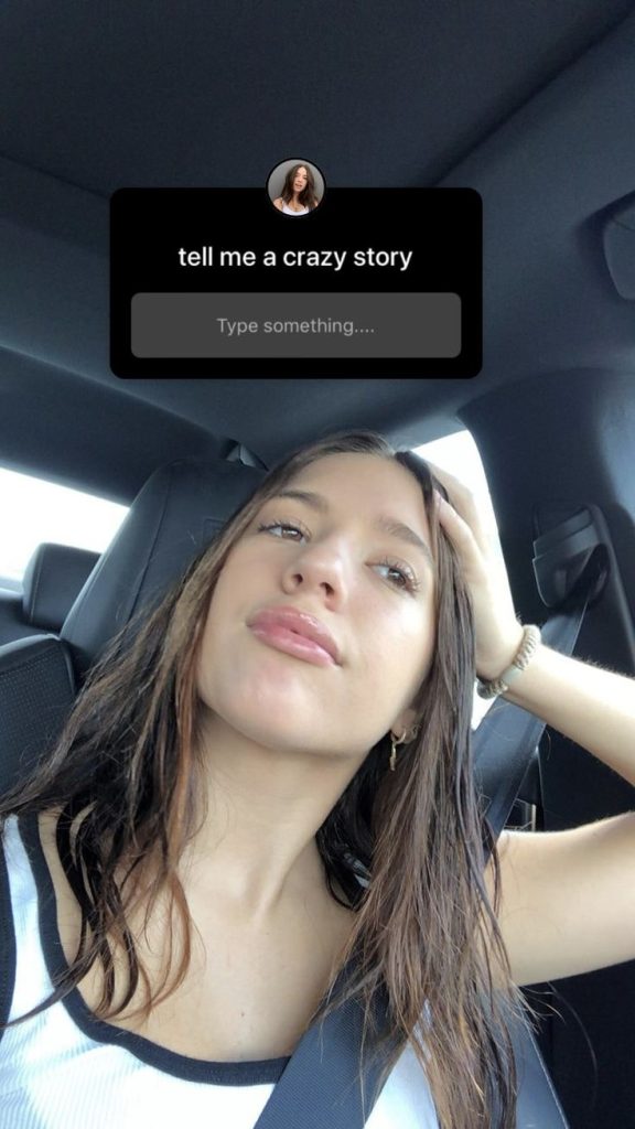
2. Native Sticker Stack
What it is: A layout built around Instagram’s built-in stickers—polls, emoji sliders, quizzes, question boxes, countdowns. Super interactive, super easy.
Use it when: You want people to do something—vote, respond, react, or get hyped for something that’s coming up. It’s perfect for casual engagement, low-effort content days, or warming up your audience before a launch.
How to do it: Upload a plain background or chill photo, then drop 1–2 stickers in the middle or lower part of the screen. Add a short line above the sticker like “vote now 👇” or “drop a question.” That’s it. It looks clean, keeps people tapping, and takes about 10 seconds to make.
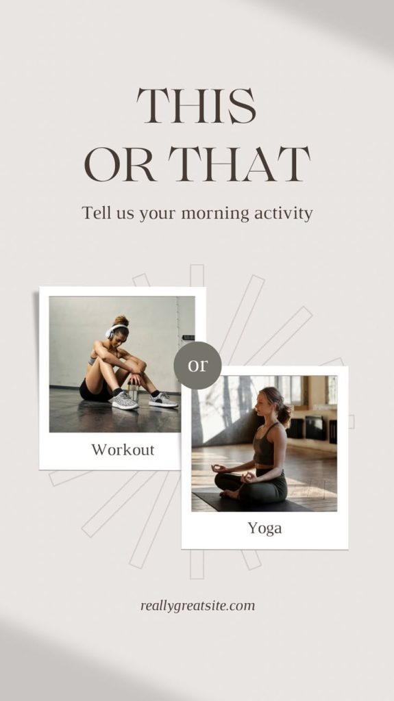
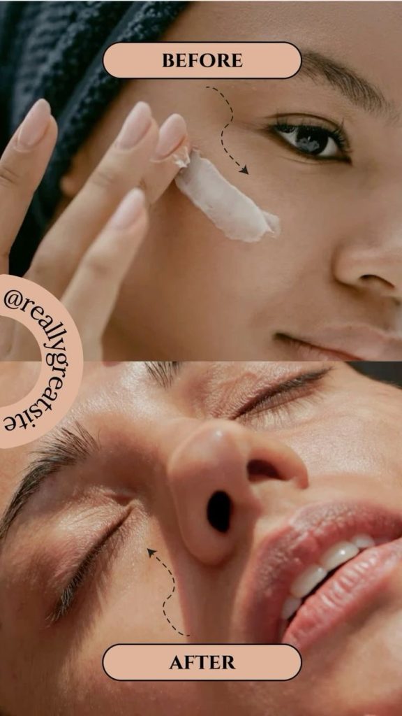
3. Split Screen
What it is: A layout where the screen is divided into two parts—side-by-side or top and bottom. It’s great for comparisons, contrasts, or showing two related things at once.
Use it when: You’re doing a before-and-after, this-or-that, outfit options, photo vs. video, or any kind of “which one?” moment. Super versatile and scroll-stopping.
How to do it: Use Canva or your phone’s collage feature to line up two images. You can also DIY it inside Stories by placing one photo at the top and another at the bottom. Add short labels if you want, or throw a poll sticker right in the middle to let people vote.
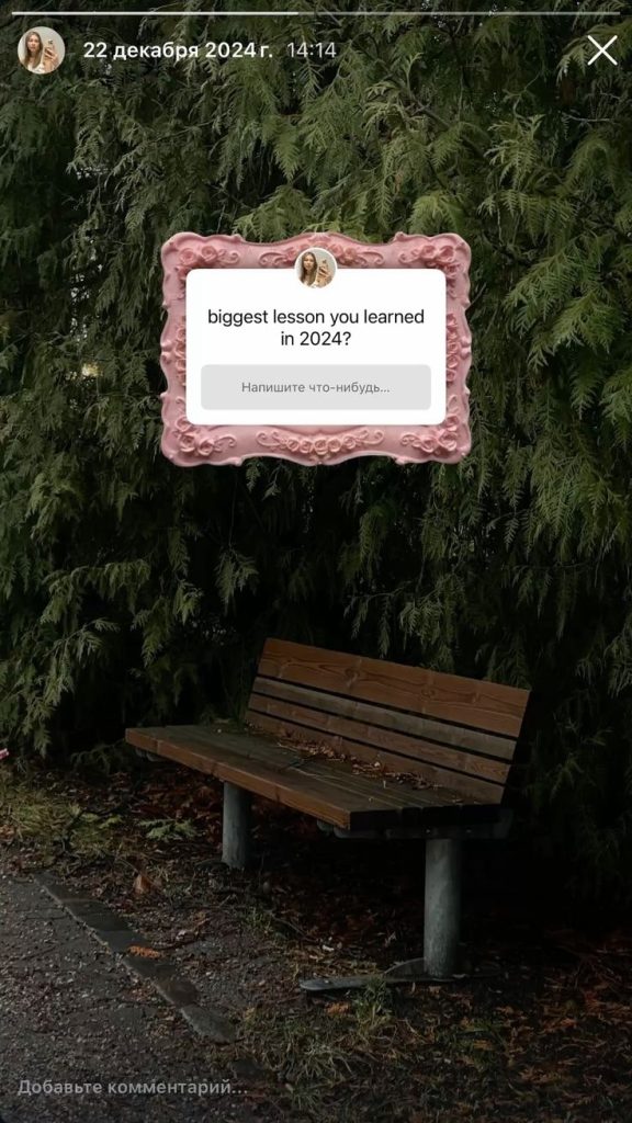
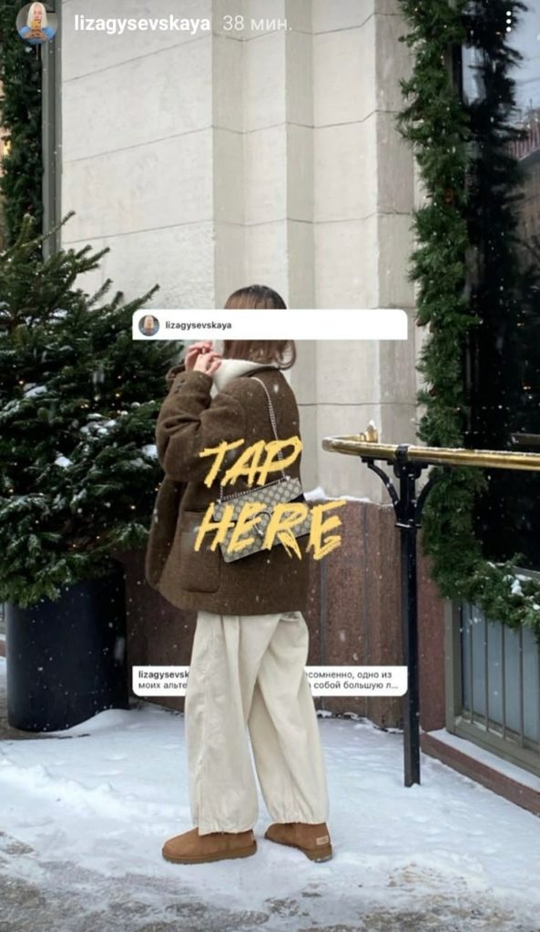
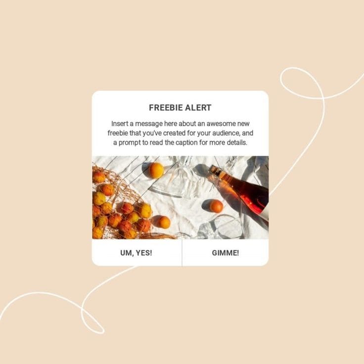
4. Framed Content Box
What it is: A photo, video, or quote placed inside a “frame” with space around it—kind of like a digital poster. It makes your content feel more styled without being overdesigned.
Use it when: You want to spotlight something—like a testimonial, a DM, a repost, or a post preview—without it just floating in the middle of the screen. It gives structure and makes the layout feel intentional.
How to do it: Use Canva, Mojo, or even IG Stories with a solid background. Add your main content in the center, then leave some padding around it. You can throw in a border, a headline, or a subtle shadow to make it pop. Keep it simple—clean lines, clean text.
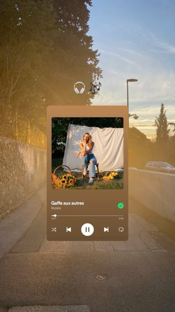
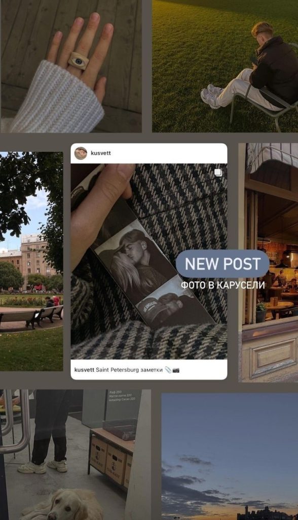
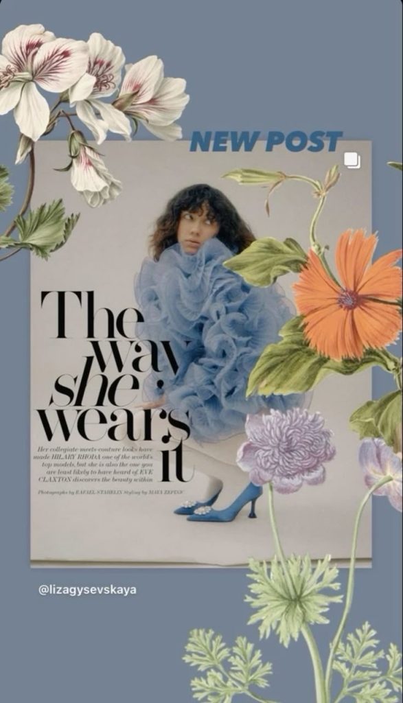
5. Feed to Story Promo
What it is: This is when you share a new post—like a Reel, carousel, or photo—to your Story so more people actually see it. It’s one of the easiest ways to boost reach right after posting.
Use it when: You’ve just dropped something on your feed and want to make sure it doesn’t get lost in the algorithm. Most people check Stories first, so this gives your post a second chance to get noticed.
Bonus tip: if your audience is already made up of people who actually care about your content, this works even better. Tools like Flico can help grow that kind of audience: real followers who are actually into what you’re posting so your Stories land with the right people.
How to do it: Go to your post, tap the paper plane icon, and choose “Add post to your story.” From there, you can shrink it down, change the background, and add something quick like “new post” or “tap to see.” If you want it to look more intentional, screenshot the post and layer it over a solid background or a branded texture, but honestly, keeping it casual works too.
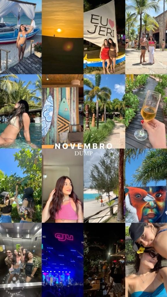
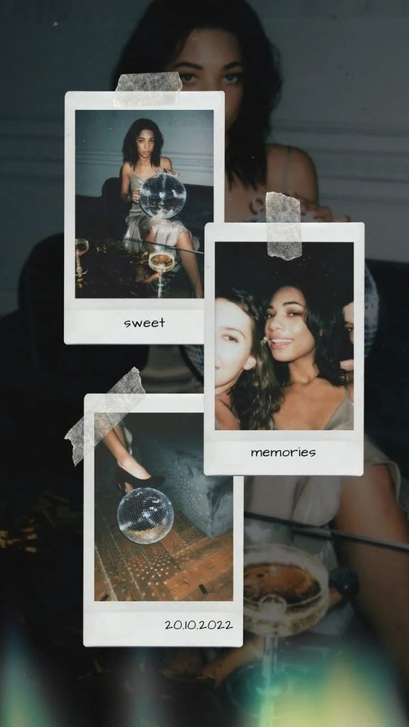
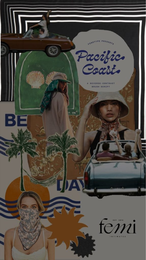
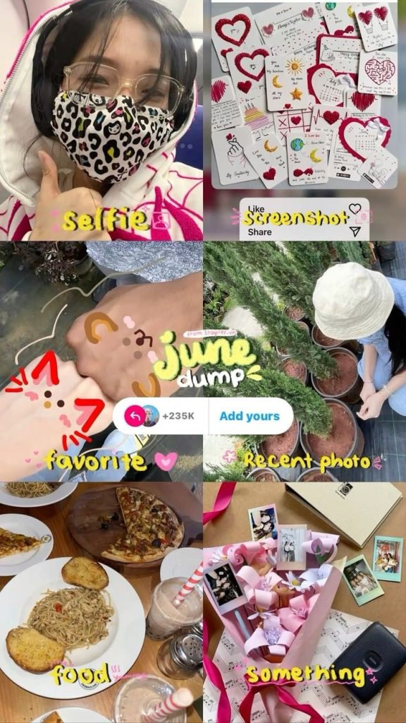
6. Cut-out Sticker Story
What it is: A collage-style layout where photos, text, and objects are layered like cut-out stickers. Think torn edges, outlines, emojis, scribbles, and a scrapbook vibe. Feels personal, playful, and not overly polished.
Use it when: You want to share a photo dump, show a bunch of moments at once, or add a more fun, handmade feel to your Stories. Great for monthly recaps, weekend roundups, or themed collections.
How to do it: Use apps like Picsart, Canva, or Prequel to layer images, add doodles, crop things into circles or uneven shapes, and mix fonts like magazine cutouts. You can also screenshot pieces from your own camera roll and arrange them freestyle in Stories. The key is to make it feel casual and a little chaotic—in a good way.

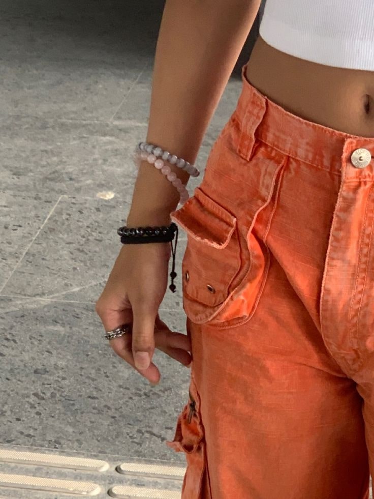
7. Zoomed-In Stories
What it is: A close-up crop of something—usually a photo, product, screenshot, or post—that teases just one detail. It’s meant to make people tap forward to see the full thing.
Use it when: You want to build curiosity. Perfect for sneak peeks, launches, reveals, or just getting people to stop and wonder what they’re looking at.How to do it: Upload the image to Stories, then pinch to zoom in until it’s all up in your face. Show just enough to catch attention. Keep it clean—maybe add a 👀 or “guess what this is?” If you’re doing a reveal, follow it with the full image on the next slide.

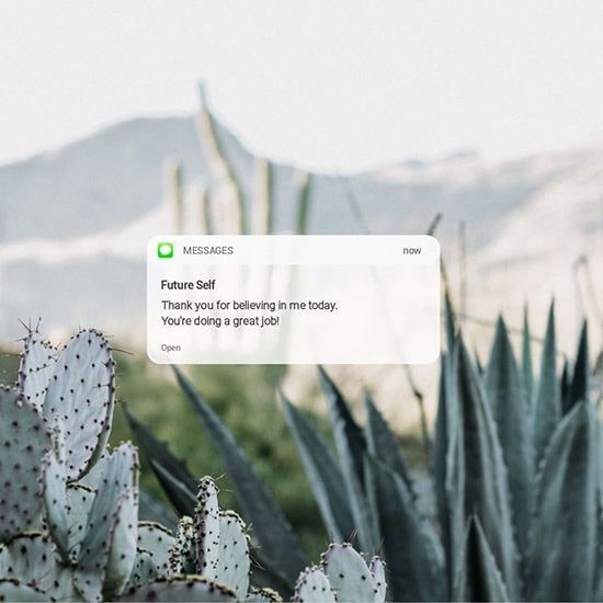
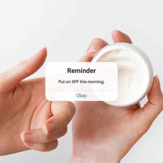
8. Notification-Style Story
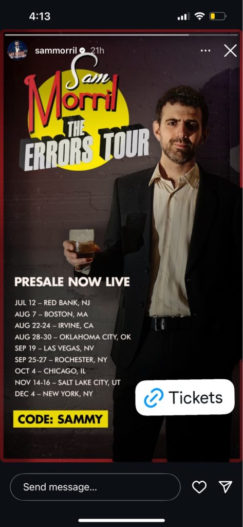
What it is: A Story that looks like a phone notification, DM preview, or lock screen alert. It grabs attention by mimicking something people are used to seeing on their screen.
Use it when: You’re making an announcement, sharing a reminder, or dropping something that feels urgent—like a launch, a limited offer, or a “just went live” moment.
How to do it: Use Canva, Mojo, or screenshot a real notification or DM. Keep it minimal—white or neutral background, simple system-style text, short and clear message. It should look like something that would actually pop up on your phone.
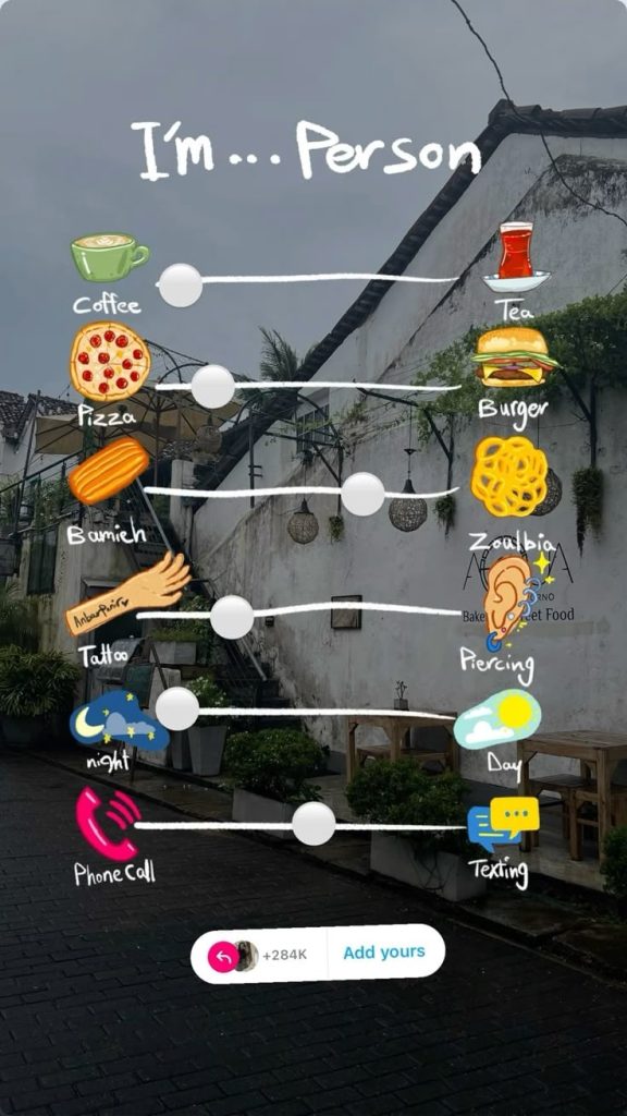
9. “Add Yours” Template Story
What it is: A Story that uses the “Add Yours” sticker—usually with a template, a prompt, or a trend people can join. It’s a chain-style layout that invites others to share their version.
Use it when: You want to start or join a trend, spark community interaction, or just have fun with your followers. Think “what’s in your bag,” “last photo in your camera roll,” or “this or that” setups.
How to do it: Create a Story slide with space for responses—can be a photo collage, checklist, or just a fill-in-the-blank prompt. Add the “Add Yours” sticker at the end with a short label. Once it’s posted, others can tap to share and keep it going. Super viral, super easy.
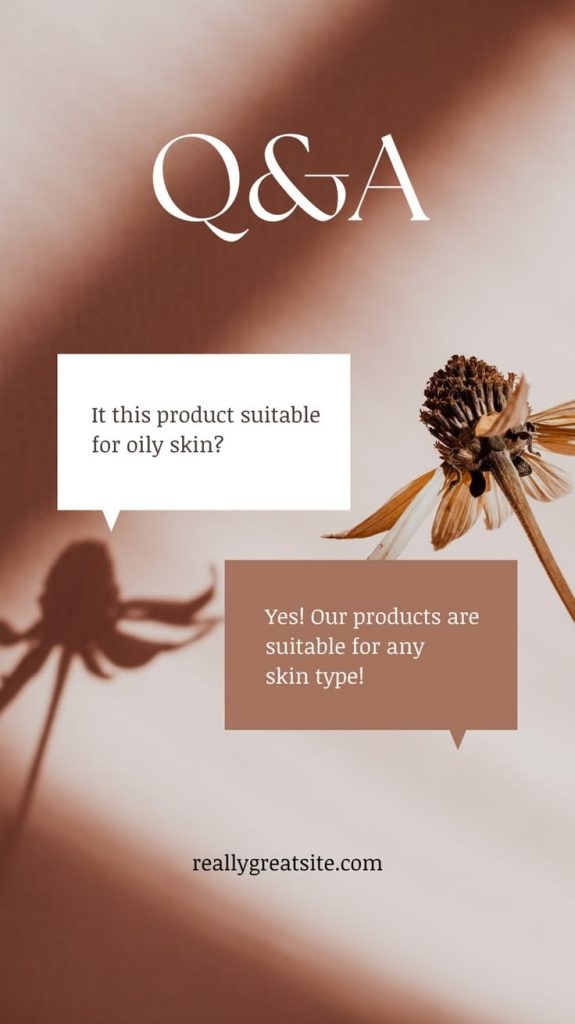
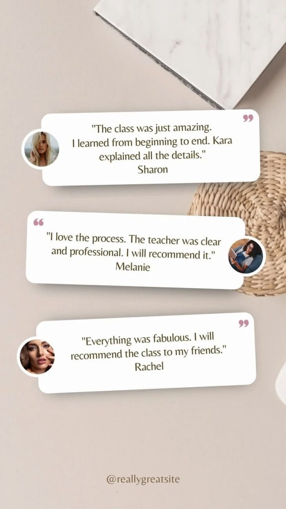
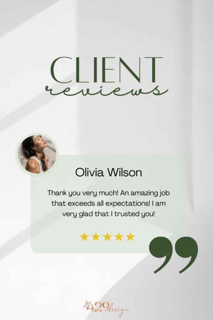
10. Review Slide
What it is: A Story layout where you highlight a short review, DM, or piece of feedback—framed in a way that feels natural and easy to read.
Use it when: You want to build trust without pushing too hard. Great for product feedback, client testimonials, or just showing that people are loving what you’re doing.How to do it: Screenshot a DM or pull a quote from a review. Drop it into a slide with some space around it, or paste it into a clean background with your brand fonts. Keep it short—1 or 2 lines max. You can add the person’s name, handle, or a little avatar if it feels right. Keep the layout casual, not salesy.
Conclusion
You don’t need to reinvent your Stories every day—just give them some structure. Having a few go-to layouts makes it way easier to show up consistently without your content looking rushed or random.
The best part? These formats don’t require fancy tools or deep design skills. Most of them can be done right inside Instagram, or with a quick tap in Canva or Mojo. It’s less about being perfect and more about being intentional.
Try a few of these layouts, save the ones that feel natural to your style, and rotate them as needed. Whether you’re sharing something important or just having fun, a good layout keeps your Story clear, scroll-stopping, and 100% you.